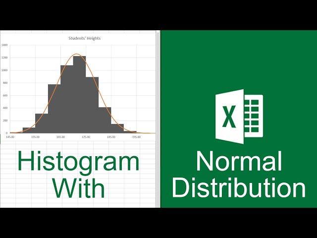
Excel Histogram with Normal Distribution Curve
Комментарии:

Where do you get the "X" value?
Ответить
Why are we multiply by 5000 sir
Ответить
THANK YOU there isnt any video like yours, i find this hardly it was very non understandable how can distribution be like a curve, how create by own and understand the whole process, Thanks a lot))))
Ответить
I'm looking to get the percentage of the histogram outside of the curve, is that possible?
Ответить
Excellent
Ответить
how did you find the variance please?
Ответить
How did U find the midpoint in the bin??
Ответить
great video! 8/10
Ответить
Why dont use answer to the questions about mean and standart deviation? How did you get it?
Ответить
Here student Number is 31. Your frequency distribution in Bins is more than 5000, How is the procedure to calculate like you
Ответить
Another question. How can I calculate frequency -15 against bin value 150?
Ответить
Omg this was very helpful I have a group research ang I'm assigned to the Organizing ang Presentation of our data. So this helped me alot for my FDT and visualization for the normality of distribution. Thankyou verymuch!!
Ответить
This has helped me so much, thank you!
Ответить
I have a data set with averages. Am I still able to use the normdist formula ? or is there another way ?
Ответить
Thank you sooo much. I have been trying to find a guide to this for sooo long and finaly something what I understand.🙏🙏🙏👍👍👍👍👍👍👍👍
Ответить
Can I save the work and reuse it by refreshing the input data and have the curve updated accordingly? I’d like to use it to show distribution of students’ marks as there are new quizzes and exams without having to do the steps from the beginning.
Ответить
When you're correcting the y-value for the normal distribution (norm.dist) did you say add 5000 times 5? (=norm.dist(cell, cell, cell)+5000*5? Or =norm.dist(cell,cell,cell) *5000*5? Your cursor covers the exact spot to see if you added or multiplied the 5000*5.
Ответить
The worst video explaining this
Ответить
Lifesaver! Thank you so much!!
Ответить
Saved an entire work my friend, congratulations
Ответить
Ty so much for showing howto add the analysis toolpak
Ответить
THANK YOU FOR THE EXCELENT EXPLANATION. COULD YOU PLS EXPLAIN WHEN ERROR BARS COME VERTICALLY WHAT CAN WE DO?
Ответить
This really help a lot for me, Respect!
Ответить
hello I am failing to download the excel sheet - is the link working ?
Ответить
can any one help with file - failing to download
Ответить
Thank you so much however, when I try adding the curve, my normal graph (lets say series 1) goes down. Now I have a curve way over the actual graph. Theres jut something Im missing
Ответить
where can i download the excel sheet
Ответить
really good! Thanks.
Ответить
Wow. This really saved my day. So much better than the other explanations I clicked through before finding this. Thanks!
Ответить
how you gonna make a tutorial video and then cut an edit in with new things done????
Ответить
Good Work, really helpful
Ответить
The sum after applying norm.dist function is not coming 1 in the y column (before applying correction multiplication). what to do please help. My data does not contain integer values; it has decimal values (float), and I have taken all data values as X.
Ответить
Very helpful video. Really impressed my colleagues with this one!
Ответить
If this is the quickest way to do it, the developers should be fired for not having a trendline available in histogram
Ответить
Oh my god! Finally! THANK YOU VERY MUCH! You saved our team! Much love and respect from department of biochemistry in Greece! (Eva, Spyros, Giannis <3)
Ответить
thank you so much for your great explanation. I really understood it. how about Excel Histogram with Normal Distribution Curve for a Likert Scale Data
Ответить
👌☺️😍
Ответить
the time I deleted the error bars, my graph was gone. What happened
Ответить
Why do we have to multiply by 5000?
Ответить
5.28
Brother, where did the 5,000 come from?

bro the moment when you created the histogram was sickkkk
Ответить
This is nice! I love the way you hacked Excel to overlay a normal distribution over a "histogram" as this is impossible to do with normal Excel tools.
One comment from me: the built in histogram add-in kills the formula. So if you plug in different data you need to redo the bins and frequency again. I would prefer to use the frequency function and a smart function to create the bins from the range and a given number of bins.

🎉😮😢😢😊
Ответить
I couldn't find the link to downloading the data you used.
Ответить
This is probably the best tutorial on this topic. Thank you!!
Ответить
Thank you so much. I spent two days trying to do it for my capability studies, since I don't have access to any statistics software tool. Xbar charts, R charts, Probability Plot, Chronological Control Chart were all good but the Histogram... Wow. I did it a little bit different (I used all my data and its normal distribution values, as well as added bar for +/- 3 sigma and USL and LSL but the error bars part was the one I needed for visuals. Thanks once again.
Ответить
It turned out that the curve of the normal distribution is lower than the values of the histogram. Why?
Ответить
Can you add percentile markers (e.g. 10th and 90th percentile) in the form of vertical lines to a histogram?
Ответить


