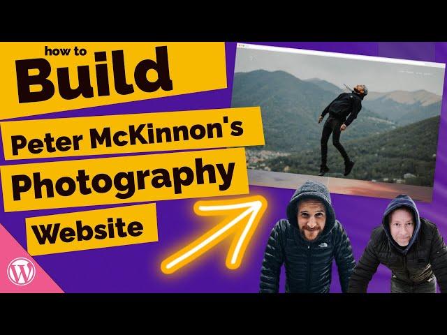
How to Build Peter Mckinnon's Photography Website using Wordpress
Комментарии:

Love these videos, so clever, just subscribed. I'm grateful to learn more webdesign skills.
Ответить
Love the video! More of a Nigel Danson and Mark Denney fan though, LOL!
Ответить
I would think it intuitive and desirable to use a block library plugin like Generate or Kadence, rather than fish around for one-off or CSS solutions to core block limitations. No?
Ответить
Awesome video, Jamie!
Ответить
Love from Egypt <3
Ответить
I love watching this series of "recreate in 30 minutes". Am learning so many practical things
Ответить
Another great recreation video, thanks, Jamie! Which is your favorite tool for pulling the YT content?
Ответить
My favorite Photographer channel + My favorite Gutenberger channel! Thanks for the lovely video, Jamie!
Ответить
Thank you so much! These 30min videos are awesome!
Ответить
For brilliant parallax effects I use the Greenshift animation blocks
Ответить
Brilliant stuff!
Ответить
Top content!
Ответить
Hey Jamie thanks for this tutorial, I just found your channel and I love it, subscribed!. I wonder, is it possible to design block theme using gutenberg builder such as cwicly or kadence and then export it as wp theme without having to instal cwicly?
Ответить
Cool Tutorial 👍
Ответить
Wow Jamie, 30 minutes, that is super fast, well done, loved the content and thank you for taking us through the process and steps as well.
Ответить
That's great. Please keep this series alive :) can't wait for the next video
Ответить
Hi Jamie. Instead of the Parallax Section I try to use the Cover Block. However, the two columns for logo and navigation are not displayed full width when aligned top center. With the alignment middle center, however, they are. I do not know why? Kind regards, Markus
Ответить
This is The most useful wp video I´ve Steen in a long time!
Ответить
Hi Jamie, really thanks for this amazing video. I found it really useful! Just one question, I followed all your steps, but I got white spaces between the parallax blocks. Do you have any idea on how to remove them?
Ответить
Brilliant video Jamie. I've tried to replicate this on my website and had a few problems with the parallax effect plugin. Anyway, I've done the same using another plugin called Advanced WordPress Backgrounds and the result is the same. The only thing is when I open the website from the mobile the navigation menu does not appear and the images don't stack one after the other in the home page.
Ответить
Criminal that this only has 199 likes.
Absolutely incredible video. Really helped me learn a lot.

I am learning
Ответить
McKinnon*
Ответить
tnk u
Ответить
Love this series. A pleasant and effective way to learn my way around Gutenberg, which I don't find particularly intuitive.
Ответить
I'm tying this in oct 23 w 6.2.3 and am havening some problem with the page option vs the site options. seem the editor has changed or at least moved.
Ответить
Great Stuff, any chance you will be making a video on using envato theme kit and elementor for wordpress website?
Ответить
Hi how does this method work for mobile UI too?
Ответить
Great video, how do you start with a blank theme?
Ответить
What the actual F... you, Jamie, are an absolute wizard,..I would do myself a disservice if I wouldn't follow you from now on. Thanks for sharing these nuggets.
Ответить
I want this website so bad but im close giving up after 5 hours of pure frustration. It seems so much harder to find the process 1 year after. I pray you can make an updated version 😁
Ответить
Thank you
Ответить
please redo the tutoriel with the current interface🙏🙏
Ответить
That looks so easy.. but so different then elementor pro that I spend alot of time learning.. is gluttenburg also a paid service?
Ответить


