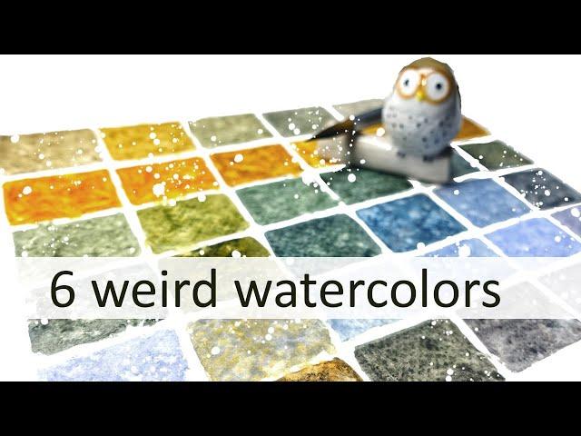
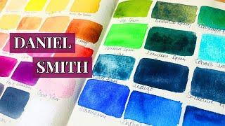
Exploring 6 Weird Watercolors by Daniel Smith
Комментарии:

I love the splashing! It seems to make things sparkle!
Ответить
Inspiring.
Ответить
👍🐨
Ответить
Never thought I’d have so much fun watching paint dry.😂😂. So fascinating, thank you so much
Ответить
I love when you do this! Anyone who is saying this is a waste of paint? Is it a waste of ink when you are learning to write or do math? No, you are learning. I've learned so much about mixing colors from your videos! Keep them coming. You are my favorite teacher. Thank you!
Ответить
I have and LOVE all of these colors from DS! I counted my Daniel Smith tubes and I have 93. Yes. Ninety. Three. 96 if you count the double I accidentally bought not remembering I already had them, lol! I can't say I have a favorite brand for watercolors because I love them for different things. Michael Harding for the absolute quality perfection, the saturation in every color (even his Terre Vertes and Lapis Lazuli are SO pigmented!), the flow, the ease of rewetting, everything. Daniel Smith because that paint brand is like your eccentric goth cousin, the entire Prima Tek line, the interesting mixes and unique pigments (or, normal pigments, just unique preparations of them!), And Holbein is your bratty 4 year old sister who is OBSSESSED with only wearing bright colors and rainbows, pastels and unicorns , neons and psychedelic patterns, crisp, clear colors and pastels that aren't chalky. Perfect for illustrative work, cartoons, and bright/pastel objects like flowers and cosplay costumes, toys and anime!
Ответить
So informative and enjoyable. Thank you.
Ответить
Thank you for explains why you set it up this way and. How you mix each sample so the current base color dominates a bit.
Ответить
I don’t know much yet but when I look at all of the squares look like they are granulating. Or maybe I don’t understand what granulating means.
Ответить
That was so fun! I have lavender that I occasionally reach for in mountain paintings, but I've never thought of using it as a mixing color! I'm seeing so much potential for cloud grey, particularly the warmest one, which is so stormy.
Ответить
You have a very unique way of mixing colours. I'm going to have to try this method. Today I picked up a lavender & lilac from a local art supplier, their own house brand called Opus Essential watercolours. That was before watching this video, so it was interesting seeing the result you had using lavender.
Ответить
Beautiful. I love how you explained how you look at the colors. All of a sudden my vision changed. Love love love
Ответить
I’ve just found and immediately subscribed to your channel. I absolute love it. This isn’t something I’ve done before, but I would like to thank you for sharing your ideas and providing us with this beautiful channel. My husband passed away a couple of years ago and I now spend a part of every day painting, it definitely is excellent therapy. I am working my way through a nature journal for my little granddaughter. I am going to start a sketchbook for myself at the same time using your lovely ideas. Many many thanks.😁🇬🇧
Ps., I’ve just heard you say you’re an acrylic painter, I’m just a bit confused!!😂😂

I loved this video. I’m very partial to Daniel Smith paints. Now I would like to see you paint an eggplant with these
Ответить
I absolutely love watching you test colors and make your color charts! I never took the time to experiment and sample and create ..and splashing before I found your channel 🙂 I’m learning so much and really appreciate the time you spend demonstrating and explaining your process. Thank you !!!
Ответить
Aussie red gold🥳
Ответить
Another lovely Saturday morning spent with Kelly. This time coffee and home made raspberry jam. Both your palette and the jam were delicious.
Ответить
We apparently have similar tastes in color. With the exception of lavender, which I also find lovely and will likely purchase with my next stock, these are all staples in my palette. Such a lovely mix of colors for blending.
Ответить
I love watching you swatch. I learn so much every time! Now I have to go get a tube of Lunar Blue.
Ответить
Love your mixing videos. So helpful!
Ответить
This is a great video!! I love color mixing! If you like the colors that actually separate, Daniel Smith’s Rose of Ultramarine and Cascade Green are extremely granulating! If you squeeze a bit onto a ceramic palette and spritz with water, wait 5-10 min. And you’ll see the 2 distinct colors in both of them! Cascade= bright green and a beautiful Aqua blue and R of U= gradient from violet to bluish lavender to red violet to bright pink.
I also notice the same stickiness you mentioned in the video when you used Rare Green Earth when I use Terre Verte. I love the color, but it almost doesn’t mix with water. It stays a bit clumpy and when dried onto a palette I barely use it and it’s gone! I thought it was me, but maybe not!
Anyhow I’m a new subscriber and I just wanted to thank you for this video! What a treasure!❤

New to this channel, definitly coming back, 'cause You talk so wonderful of everycolor and made me start thinking in a nother kind of way...So fun to get new inspirational thoughts. Thanks
Ответить
❤️❤️❤️
Ответить
I think you are my new best friend
Ответить
Brilliant colour mixes for Australian eucalyptus trees
Ответить
Really quirky colors! Far more interesting than pure color swatches. Makes me want to experiment.
Ответить
I’m interested in the Aussie gold now! I have both lunar blue and lavender and I really like them.
Ответить
This palette is fascinating, it screams cavepainting. Love it ❤ I will he running to the store for some lavender, I adore anything muted down / greyish and I had no idea lavender could do that, thanks so much for the tip!
Ответить
sadly everything is BLURRY... and 1008p HD option is not available...just the lower high definition. The maximum you offer is 720...makes it blurry for me...too made you could not do the higher resolution...even your writing above the swatches is illegible...such a shame for such an awesome COLOUR EXERCISE...
Ответить
Do you have a painting to show that includes these6 colours...in actual....APPLICATION?...THANKS JANIS
Ответить
Thanks! I think my favorite is the lavender. It is so versatile. On the other hand I also like brights. By the way, your second row made me think of Mac and Cheese, lol. But best of all, you made me think and consider different ways of using color.
Ответить
You had me at “weird”!!!! Love that this is becoming a series!!! Thank you!!!
Ответить
The lavender and rare green earth mix is exquisite! I would never have thought to mix those. "The only wasted paint is the paint you do not use".
Ответить
Amazing video! I’ve learned so much! I have most of these colours, I’m going to give this a go, thank you so much ❤
Ответить
This is the first mix paint video that I’ve watched to the end. I learned so much but the biggest thing was that i tend to add too much of a color when i mix my paints. Thanks for the great video!
Ответить
You talk.
About the granulation.
, but I see a pattern and it looks like it's from the paper... why not. Use untextured paper?

I love, love Daniel Smith’s Lavender. When refreshing my stock, I went with a recommendation I heard on YT and bought Van Gogh’s Lavender instead. It’s about $10 less and it’s gorgeous! Uses the same exact pigments (PB29/PV19/PW6), but it is just a tiny bit more on the purple side. Course, you can add a dot of Ultramarine Blue to “fix” that, if necessary. It granulates a bit more, too, if you like that.
It was a great buy! Especially for those that need a less pricey alternative! ❤

Wonderful muted colors. Your "diagonal" method of mixing/swatching is the one I learned in art school 40 years ago, and I do see some other people still following it. I didn't know that lavender muted other pigments; I'm guessing it has some white in it. Love the effect, thanks!
Ответить
Thank you for this video. Very insightful and it inspired me a lot.
Ответить
Hi - Where do you get the DaVinci Joyce's Mother Green? I've looked at several retailers and no one seems to carry it. Thanks!
Ответить
I really liked the Aussie Red and Lavender. Lavender was a total surprise.
Ответить
This was so informative and excellent to watch. Thanks for the great tips about mixing, too. Love your mixing page and how you keep a horizontal line of the single colors.Thank you again!
Ответить
I love this video and Daniel Smith watercolors. It would be difficult to choose only one. I have subscribed and look forward to watching other videos that you have created. Thank you!
Ответить
This is waaayyy better than late night snacking... who knew colors could make me drool...
Ответить
Lunar blue and lavender mixed is probably my favorite. It looks like it would be perfect for stormy skies and seas!
Ответить
Super fun to watch these swatches. I usually work with colors that I put in a pan and cure before I reactivate the water colors. Never tried working out of the tubes
Ответить
I’m a landscape artist and Lavender, Aussie Red Gold, Green Earth, and Greenish Raw Umber are among my most used paints. I use Lavender mixed with just about anything, but especially earth tones, to get gracious neutral grays. It’s also an essential for my skies. Aussie Red Gold mixed with saturated blues gives you gorgeous deep greens. Mix Greenish Raw Umber into Cerulean or Cobalt blue and watch magic happen for distant hills or lakes. And Green Earth always plays a role for me when painting evergreens and forests.
Ответить



![The Demon (1978) Original Trailer [FHD] The Demon (1978) Original Trailer [FHD]](https://hdtube.cc/img/upload/RUNnd2tPLVR0cF8.jpg)


