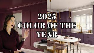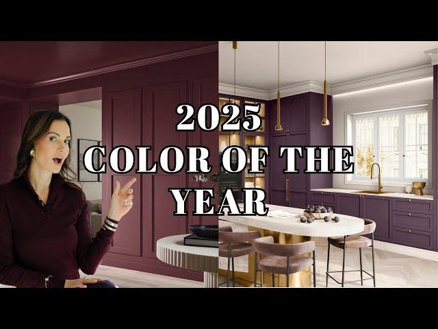
2025 COLOR TRENDS | Color of The Year Revealed!
Комментарии:

100.000 🫶
Ответить
Your puppy is so color coherent that it makes the video even more enjoyable!
Ответить
Hehe I love a pop of chartreuse, but I like a more green-yellow chartreuse than a yellow-green. I wouldn't use it on an entire wall, but I've been enjoying adding little accessories or small furniture pieces.
Ответить
Chartreuse = NO Cinnamon Slate, Clove, and Raku = YES!!
Ответить
Clove is my favorite
Ответить
Dunn Edwards caramelized in kids bedroom is uhh haa loove
Ответить
The purples are great. Surprised that you were so strongly opposed to chartreuse. I am not an interior designer but in my garden I always contrast the purple leaved plants with chartreuse green .
Ответить
Use a colour that you love until you get tired of it. Change colours as much as you like - just depends on what colours you love during each season. Of course, I am talking about painting of the walls with different colours. Use neutral colours of surfaces that is expensive to change every so often. Colours are dependent on our moods and experiences. What will trend in 2025 is pleasant happy colours. And that is what will trend with your life.
Ответить
❤Loved all shades of bordeaux and purple. My absolute least favorite color is the chartreuse. It hurts the eyes.😮
Ответить
Hello Nina. How are you. You always have beautiful flowers with different designs. I don't know if you do it yourself or if you have another talented person in your team? Would you do a tutorial for rest of us? 😊 😅 ❤️
Ответить
Sun bleached!! Is my favorite but then I love whites and am searching for best white for my midcentury modern home.
Ответить
Bullshit. You don’t even know how the color looks like on the wall.
Ответить
Of course hate blues unless it’s from your brand / company it’s all about the money be honest
Ответить
Now you can change the sofas too
Ответить
Cinnamon Slate all day long!😍
Ответить
Raku is so pretty - my favorite! What is the name of the color after Raku? Carmelized is a little too orange. The Chartreuse is my least favorite color.
Ответить
cinnamon slate! gotta have it in my powder :)
Ответить
Purple basil and cinnamon slate are my fav!
Ответить
99.8k! I can’t wait for you to reach 100k! So we’ll deserved!
Ответить
Enjoyed this video, I build high book shelves/ TV unit using the colour valspar but I guess that is colour you definatly need to be careful with
Ответить
Always look forward to the paint episodes. Love the colors of your outfit. Have a lovely week❤️❤️.
Ответить
Loved the burgundy’s, purple basil for a drenched bath with zellige shower tile to match. The chartreuse was just a big miss and I cringe at peach paint. All in all, I think they did a pretty good job this year with color selection.
Ответить
Love Clove and adore Rumors and Raku ! Considering something like them for my kitchen .
Ответить
I loved Clove and Raku the most
Ответить
enjoyed the video but really wish there was more time spent on looking at the color and the designer rooms - the images were too quick
Ответить
I do like the burgundy
Ответить