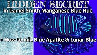
Daniel Smith Manganese Blue Hue Watercolor + How to Mix Primatek Mineral Blue Apatite and Lunar Blue
Комментарии:

Thank you for your video. Very interesting to know. It takes the art pieces one step further. Informative, never too much for me!
Ответить
Thank you for a great video. I had and cherished a Windsor & Newton manganese blue. The DS is just not close enough, if you ever find a better substitute, please let us know.
Ответить
That was a really excellent point, about pigment chemicals being mixed in the stones themselves. I hadn't heard that anywhere else, and i think it's a very valid point. On the one hand i "fell" for the romance of painting with the actual gemstone/etc, and felt kind of ripped off - they're SO expensive. On the other hand, they are still some of my favorite colors. That's why this series of yours is so valuable - knowing how to mix the comparable color for a fraction of the cost (and you DO get as close as I've ever seen). So i probably won't be buying much of the Primatek line in the future overall, there may be one or two "convenience" colors I'll stick with. Another really informative and in-depth review. Really excellent. Thanks!
Ответить
Awesome video so helpful! Thank you
Ответить
So I added my two cents in another place, but I will put it here. My wife is an artist and was excited to get the PrimaTek colors. I am a mineralogist and knew that something was off, but she was happy and the colors are really nice, plus you can get some good textures. Anyhow, one day I took a couple of her paints into the lab to perform some elemental and phase analyses on them. Low and behold, they were far from pure minerals in a gum arabic base. It is important to note that 90% of minerals powder up white, even quartz (amethyst), when ground will look white. Also, most mineral sources mined have ancillary minerals with them that get ground up along the way, thus you will rarely ever have a pure single mineral pigment. I emailed DS and asked about the data I collected and never heard back. I really like the idea of returning to the use of base minerals for pigments. The colors are really nice and technically those minerals are there...just in very small quantities.
Ответить
very informative, this is like csi for paints. presumably the fluorescence has an effect on how the paint looks out of the tube / and when painting, which could be why it is your preferred choice over the options from other brands. but - as you demonstrate - that 'effect' will be gone after approx one year, so the b15 will be back to looking the same as the b15 in the other manganese blue hues. i wonder why ds didn't label the fluorescence. not great on the back of the primatek situation.
Ответить
Thank you for this video! I am an art supply hoarder as well. I have so many different brands and so much paint! I like that you used a black light, I think it's very useful to know what is in your paint, that is why I am learning how to make my own. Just because we prefer a brand we should never assume that they are going to hit it out of the park with all their products. Although I did find the response from DS a little condescending, I still love their paints. They just need to be truthful. Nothing wrong with saying that we have to do it X so that we can have consistency from batch to batch. If people know how paint is made then they would have a better understanding of the controversy. I hope that you will not be attacked by people who are uneducated in printmaking. I love your videos please make more!
Ответить
I was also wondering about the blue glow of the lunar blue. Never had the manganese blue hue to notice that!
Ответить
oh my my danny just loves to add secret pigments to the paints...
Ответить
I just bought some blue cobalts (M Graham, because why not, I don't have any of that brand, and online swatches got overwhelming), and just now saw that Insta geologist has Sleeping Beauty as mostly PB28 with some earth minerals for the naturally-occuring dirt. (I mean granulation; lunar black?)
I feel so stupid for not knowing I had more cobalts on hand already! 😂 Wonder if I have some surprise cadmiums on hand?

So interesting! I am always fascinated by your analysis and will willingly follow you into the deep weeds! LOL! I am very intrigued by this now. I never had any of the Magenese Blue Genuine but LOVE the Hue. After all, it's close to "Carolina" Blue! I also adore the granulation and liftability. I agree with you in that I am not brand loyal, but pigment loyal. Certain brands do certain pigments better than others. All of my palettes are mixed brands. Thanks so much for all your research. I ALWAYS get excited when you have a new video!
Ответить
I'm not a fan of the inclusion of the optical brightener and the fact that they still labeled it LFII is just another nail in the coffin for me.
It's intriguing that they managed to make the PB15 non staining and heavily granulating though. I'll see if this one is on my DS dot chart, it might be fun to play around with.
I would never have paid attention to this color because early in my watercolor journey I accidentally bought manganese blue hue by Mission Gold and Van Gogh (if I recall correctly) and both were just regular PB15 and fillers or maybe even white. A complete waste of money.

Nice
Ответить
This is really interesting, and I appreciate all the hard work you do. The alternatives and mixes give everyone a chance to try new things while remaining neutral. As for this color, I've been avoiding it all along because I thought it was just a mix of Phthalo Blue GS and white, which does not interest me. (I think I may have ended up with a tube from another brand that was.) So, this was enlightening and made me want to try it, especially for mixes. Since the florescence doesn't affect the hue's lightfastness, I'd be ok with using it for finished pieces.
As for the ordeal, I think everyone should just decide for themselves. I've been a big fan of DS paint, and have more tubes than anyone really needs, but the response was less than stellar. Most knew that the Primateks were doctored, but it was that "bad" handling (and lack of clarity) that set people off. Unfortunately, many people are naíve to think that any of these other companies aren't hiding things, too. One just got caught. Personally, I will continue to use what I've got, and maybe add a tube or two to mix my own Primatek versions once they run out. However, there are some pigments they just do best. I'm into several brands, so loyalty isn't an issue, and Roman Szmal has become a new favorite. But, I'm also curious to see how or if they clear this up, since I can't imagine it not hurting their sales a bit. Hopefully, some clarity will come. There's no need to artists to take out their frustrations on each other. Buy or don't buy.

Love your take on the primatek “controversy”
If you believe marketing from manufacturers, you will be deceived. These paints are expensive. If you like them and can afford them, use them. If you think “natural” materials are somehow simpler than synthetics, you could not be more wrong. If you’re buying pretty paint from DS, they will deliver. If you want to buy a story, join a religious cult

This was a wonderful encapsulation of information! However, I’ll have to watch it many times to absorb everything! I have made a habit of staying away from paints that say “hue” because I think I’m more of a purist. But you have totally peaked my interest in the effects that can be had by trying something new! Thanks!
Ответить
I love manganese blue hue and it's on all my palettes. I discovered the glow effect a while ago, when I was checking a student brand I bought for flourescents and then thought to check all my swatches as well. Funnily enough I plan on doing a picture with fish as well lol- I just haven't got around to it yet. MBH is really good for getting that cloudy effect that olives and grapes have- the granulation seems to push through and settle on top of some other colours which can be quite effective. No other paint I've tried does the same.
Ответить
The more I learn about Daniel Smith the less I like their business practices. It is disturbing and disappointing. I don't care if they list everything, but if most of the pigment is synthetic or if you use optical brightners label them as such. Their less than optimal response just screams unprofessional and childish, like a teen getting caught cheating on a test.
Anyway, thank you for your testing! Love your data base and your videos! Happy painting

I am sympathetic to the fact that not everyone is science/geology savvy(I'm by no means an expert and only took 2 college-level geology classes before I decided to pursue equine instead), but it was a big ol' duh moment for me. It's absurd(for me, I'm having trouble articulating my thoughts at the moment due to only having about 3ft of visibility in this brain fog) to think that they are solely grinding up high-quality precious stones and shoving them in tubes. With that being said, I do think the lack of transparency is punishable by disappointment and distrust for those who care about it. Especially when it comes to a company that promotes itself as trying to be more environmentally conscious.
The brand loyalty and hype thing never seem to work out well. Funnily enough, I do have a loyalty to DS Manganese Blue Hue. I love it. It would take a lot to pull it from my cold dead hands.
I've been watching through your videos recently, for some reason you don't pop up much on my feed and my ADHD brain forgets anything I cannot see in front of my face. I think I could listen to you read entire technical textbooks and I'd still thoroughly enjoy every second of it. Thank you for your knowledge, your calm voice, and for existing in general. You and Oto have been a HUGE help to me when it comes to picking paint. I can't remember the last time I didn't consult your content when considering purchases.

It wouldn't be so much an issue if Daniel Smith was fair about their pricing and forth coming. They claim/imply the price is high because of the amount of rare minerals they are using in their paint: a straight up lie. This is what people are so hot about. If they said the pricing is what it is, it would be different. We all know that art suppliers mark their product up 1000 percent of the cost-to-make, often even higher*. They justify this by assuming there would be no art without their product. *Well, they are wrong This is why artist are moving away from art suppliers to handmade paint and product made by artist who make small batches of their paint with care. Also, once one knows how to make paint, which any artist can do , freedom occurs and there is no limit to the color hue, tone, spectrum. GOD BLESS.
Ответить
Interesting and informative
Ответить
Hi Kim, I'm curious if there is one particular DS set that you're super happy with or even just a couple of additional colours from DS that you would recommend for someone with an already pretty good set of professional paints.I followed your advice on your top recommended pigments and have put together a pretty complete pallete of basic pigments. I am just curious about DS and thought, hmmm, maybe I should just get the primary mixing trio? I do know that I'm still missing a good viridian and a good granulating French Ultramarine so maybe I should start there?
Ответить
I was mixing a lunar blue dupe last night. I don’t have the manganese so I used regular phthalo and pbk11 from Roman szmal due to its heavy granulation. The resulting colour was very close. I was putting together a travel palette and deciding which colours to include. I found that many of the Daniel smith convenient mixes and some primateks were pretty easy to approximate so the only DS colour that made the cut was quin burnt sienna.
Ответить
I’m glad someone else also found this out! I noticed it maybe around one year ago, when I had painted a bird and used this color in it, and left it in my kitchen wall to dry out. We have a “mosquito lamp” on at nights in the kitchen, that has that blue light, and in the night when I went to get water, I saw that my bird painting was glowing in dark 😂 I figured that either it has fluorescent or bright white mixed in, but it was so glowy that I figured it might be the first option…
Ответить
There is no such thing as excessively informative! This was a wonderful video and a wonderful painting, thank you so much for sharing your experimentation with all of us!
Ответить
the way my jaw dropped when you pulled out the black light. Wild
Ответить
I just dabble in watercolor for therapy, but I love working with pro paint because the pigmentation is so rewarding even with my blobby messes. I gravitated to Daniel Smith because they provided a straight-forward essentials set and I thought it made more sense to buy than to risk the frustration of muddy mixes as I was starting out. And then, since DS is local to me it's relatively easy to find deals on additions to my essentials. I've grown my set of tiny DS tubes way too large, and it's actually a management problem. I branched out into Winsor Newton for one tube, and I like them too! Anyway, I am not one to take a side. Coke and Pepsi are both fine. Canon and Nikon make all levels of cameras and are awesome. I've owned both Fords and Chevy's and loved them both. And I have a degree from each of the two main rival schools in my state of Washington, so I win no matter which team takes the Apple Cup. As you can see I'm a pure centrist, but I mostly only have pro-grade paint experience with DS. Do you think other pro-level paint companies have slightly disappointing secrets too? It seems to me that DS is especially picked on, but maybe Windsor Newton, Holbein, etc. has some trickster mixes too? I'm just asking the question because I'm curious. Just as with everything else I've mentioned, I have no skin in this game.
Ответить
<<<<<<<< Hoarder!
Ответить
I love mixing my own colors so do all of the phthalo colors separate in the granulation mixes? I actually love color separation.
Ответить
Do you know of any other watercolors that glow like this (besides opera pink). I'm loving how I can paint something that under regular light look like a "normal" painting but when you shine a uv light on it "SURPRISE" it glows.
Thank you for all your work....I would have never guessed I had a color on my pallet that glows like this otherwise. Now I check every color just in case. 🤣

Love your video. And listen couple times.
Ответить
Cool 👌❣️
Ответить
So happy I found your channel!
Ответить
I've had Daniel Smith's manganese blue hue on my palette for a couple years, and I love it as a bright sky blue. It's so fascinating to hear that it's actually fluorescent! Your use of the fluorescence in the final painting was really cool to see, and is definitely a dimension of watercolor that I've never considered before. Thank you so much for sharing!!
Ответить
I've still got a 6ml tube of Old Holland Manganese genuine and it's so precious isn't it! Thanks very much, x
Ответить
Great video! Thanks for the info!!
Ответить
Very interesting video! If you want to replicate gemstone paints, the solution is to buy said gemstones and grind them in a mortar and pestle, then mix with binder. Daniel Smith Primatek colors are NOT genuine. The bonus? You get much better colors and you know exactly what is in them.
Ответить
Another excellent and educational video. I kind of wish I could bring you shopping for watercolours with me!
Ответить
at such small amount, I'm wondering how toxic this is. unfortunate.
Ответить
That looks so cool with the black light!
Ответить
When comparing my tablet to my swatch card the tablet is reading closer to cobalt blue..interesting. now to figure out how to adjust mixes etc in my mind.
Ответить
What a great video!
Ответить
You're Awesome! I'm new to the craft and all in for the journey, just looking to find my niche /specialty skill. Good on you for putting out important and helpful information. Just from a beginner's standpoint, I'm trying to keep things basic with supplies and avoiding mistakes, which number more than the total colors of available paints. lol
Ответить
It would be interesting to see these colors compared to the Schmincke supergranulating paints. They do have a few colors in their range where PBk11 is mixed with blue pigments. Does someone have both?
Ответить
Dziękuję bardzo ❤️
Ответить