Комментарии:

First!!
Ответить
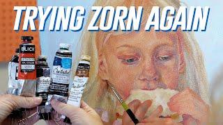
beautiful work! Agree that your warm and cool balance is working great here! I think it might be your value scale that is irking you - I suggest taking a b&w photo of the painting to see where the color weight is too similar and not contrasted enough. Hope that helps - love seeing your process
Ответить
I think @chrissiespanda is onto something. I think that because you didn’t use the black very much you’ve achieved an absolutely ethereal pastel palette, which personally, I love. But, i think the part that might feel “off” to you is the low contrast. Also, do you ever try vanishing your oil paintings? That might help punch up the contrast and vibrancy a little bit.
Ответить
it's lovely to see you properly getting into oil paints, one day I'll be brave enough to join you 😂
Ответить
Great painting! I haven’t tried the zorn palette yet. I think if you had a stronger light source you was have had an easier time. I would also take my painting to the mirror and literally paint backwards, because it’s easier to see what’s off.
Leaving paintings unfinished look beautiful. The lack of detail in the sweater brings all the attention to the face which is good. Honestly I would have added some abstract marks to add to the red in the corner. That way the viewer can fill in the rest of the information with their imagination!

watching this after a long day of studying is all i need to relax again
Ответить
I like both of your paintings
About the zorn palette though it's is good and everything and I use it myself but it's also modified lol not only with one color but two lol maybe you can add both blue and the cad light one too. I think you already found a palette that works for you.

Sending love and support in these dark times. The painting is cute, but I think the thing that is standing out to me as maybe a bit off is the right eye as we look at her. It looks a little to downturned, and a little too cross-eyed. It kind of makes it look a little bulgy.
Ответить
I really love this one! Even more than the last - it feels dreamy and nostalgic. The eyes have this blurred, innocent spirit to them.
Ответить
I think the painting may have benefited from a darker background, I think it would've helped bring out the colors and add contrast.
Ответить
Heya! Don’t know if it’s just me but I’m thinking the addition of the blue might actually be the problem here. The intense warmth of the previous painting gave it a nostalgic, old summer memory vibe and that was so so pretty and dream like. Here I think the blue works okay everywhere but in the face. The blues and purples you’ve added are more often associated with older people’s skin, so to me it seems a little strange to be seeing it in the face of a child. Perhaps a deeper ultramarine colour could have worked better to punch up the contrast without making the skin look sickly or thin. I’m also thinking that the eyes may have closed up a bit too much somewhere along the way, from what I could see in the reference picture. That being said, I think this is still a lovely painting and with an extra day of work it could be as successful as the previous one. I love your paintings and I’m enjoying watching your quest toward a concise body of work. Keep it up <3
Ответить
I thought this was supposed to be a portrait of a little girl… if not then the anatomy is off. I also think there’s not enough darks. You’ve got skills though girl, I would love to be able to paint like you!!
Ответить
I think it might be the eyes? Not sure exactly why but they seem uneven. Covering up either side of the face fixes the “weirdness” for me. Also they kinda look like they’re looking different directions.
Absolutely not a flop though! Even great art has flaws. 😊

I think it’s a really visually successful pastel red-yellow-blue limited palette, but it doesn’t really read as a Zorn palette to me.
Ответить
Oh man. I can definitely relate. Feel better 🤗💕
Ответить
I think it looks really soft and soothing❤❤
Ответить
Get well soon! :)
Ответить
Honestly I think you probably struggled a lot with this painting because you did light first. With oils it is SO helpful to start dark to light. It’ll help with that saturation and contrast you like to have in your paintings, and they’re so easy to lose when you start with the light colours. And you started VERY light.
Ответить
I think an interesting palette to try is to keep the Cad Yellow addition from your last video, but swap the Ivory Black for a Paynes Gray, which can give more saturated blues while keeping that depth of the ivory black.
Ответить
“Because i love looking at it so much” ❤ truest true love
Ответить


![전동창 천창 움직임 [ 피오리시스템 창호 ] 전동창 천창 움직임 [ 피오리시스템 창호 ]](https://hdtube.cc/img/upload/SU1SbVdXam9PWUY.jpg)

