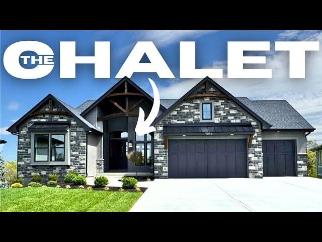
Finally! A Custom Home with The Layout I've Been Searching For!
Комментарии:

Very little cabinets compared to what My 1300 sqft house had.
Ответить
Put doors on the open cubbies, don't want to see a bunch of stuff stored.
Ответить
Really? I'd rather have a regular sized shower and a free standing tub.
Ответить
That den off the kitchen would be my 2nd pantry.
Ответить
Beautiful home but I miss the days 1.2million bought you a 5br mansion
Ответить
I really like this one. I love finished basement areas with bedrooms.
Ответить
Silver things on wall are used for clean out covers for drains
Ответить
I love this house as well Timothy. I have to agree though, why is there NOT another laundry room for the rest of the family to use? I love the layout and that the bathroom is near the entrance of the front door. Whew!!! LOL! I would have liked to have the other appliances included in this house and the other ones in Kansas as well.
Ответить
Enjoyed
Ответить
I absolutely really love the layout of this place and the exterior of it. Since it's already sold, I would turn that basement into an apartment.
Ответить
current KS resident, just wanna let yall know that we have beautiful mountains and gushing waterfalls. best place to live on earth
Ответить
Beautiful home However the master Bath is very underwhelming
Ответить
$1.2 million and under 4K square feet?
Ответить
Gorgeous!
Ответить
Nice home. I would change the butler's pantry into a laundry room.
Ответить
On the plans there is a room sandwiched between the office and the garage labeled with an L. I believe that is a laundry room. Yes, the plan does show that one room downstairs as storm. I'm not overly fond of this home. For some reason it feels disjointed. The kitchen has very little storage. Thanks for the tour. 😊😊😊
Ответить
Hey Timothy , I was wondering if I could help you grow your channel and get more views on your videos with my strategies and experience that helped my clients too , let me know what you think ??
Ответить
That exterior color is "chef's kiss"... I love homes in this color.... I need to get on Onlyfans and sell my soul. I want this home... right tf NOW!!!
Ответить
I’m not a fan of the full bath so close to the front door! It would be better to have an en-suite for that bedroom.
I would think a storm shelter should have a reinforced ceiling.

I never understand the primary bedroom being right off of the living room. Privacy and quietness is nonexistent.
Ответить
These sinks are placed terribly for real life.
Ответить
Should’ve had an upstairs
Ответить
Primary bath stone is marble not granite and the two slabs are book matched. Love love you videos!
Ответить
What a unique exterior! You will love it or hate it, no in between.
Thanks for Sharing Timothy!

Master bath counters and walls are porcelain. You can tell because the cut outs at the under mount sink are not a through body product, the edges are white. Also, the shower is trimmed with Schluter. Marble doesn’t need trim, the edges are polished. Large scale porcelains have very convincing visuals, are low maintenance and less expensive to buy and install. I wouldn’t use it on a counter because the laminated edges are very fragile.
Ответить
This layout is everything. 🔥❤️
Ответить
I don't like the bathroom outside of the bedroom
Guest would be in the sitting area, you would not have privacy coming out the shower

It’s a beautiful layout outside the laundry room being only accessible in the MBR. Having another laundry room would be even more for this.
Ответить
Nope, not Kansas.
Ответить
👏🏻👏🏻👏🏻👍🏻🤪
Ответить
I suspect you missed the washer/dryer hook ups in the garage.
Ответить
Another crappy design 🙄
Ответить
Other than the laundry room situation, it’s a great home. You can definitely see it’s quality construction.
Ответить
Absolutely Beautiful ❤
Ответить
I like that you show house plan, that make it easy
Ответить
I'm sorry, I did not like the kitchen in this home. I was not wowed.
Ответить
That is the ugliest new build facade I have ever seen.
Ответить
My biggest disappointment with this fairly expensive house is the heating system, floor heating is so much more efficient and comfortable, I'd rather pay a bit more and have a smarter home.
Ответить
i don't understand why builders think people want to see the kitchen when you come in the front door it's like entering into a mobile home and now a lot of them don't show the kitchen coming into the home the floor plan is not for me
Ответить
The master bath is a real disappointment
Ответить
The room in the basement could be used as an exercise room. Those silver plates on the wall in that room are for the sewage clean-outs. These are very common in basements.
Ответить
HATE when these guys narrate the video. We don't need any advice on how to use spaces or decorate. Just put some muzac over the tour snd let us take it in! LOL Bookend the deets! Save the narration for the seeing impaired broskis.
Ответить
I cringed every time he says the word "master".
Ответить
Love this kitchen and boy could I get some baking done in this house…. Just love it. Love almost everything about it.
Ответить
LOVE ❤️ IT!!
Ответить
Many great features in this home, but I was disappointed when you showed the cultured stonework on the living room mantel. Call me silly, but for over $1M, I would expect more than something that looks like a DIYer could put in from both a materials standpoint and quality of installation.
Ответить
Nice house but I do not care to hear laundry noises when trying to read in bed or sleep. Deal breaker for me. Moreso if I worked all day.
Ответить
Love this home. It has everything you need. The room off of the game room with the silver plates is listed as storage on the floor plan. However, it could be utilized as a flex space or anything you wanted it to be.
Ответить
Sliding barn doors are SO tacky. I hate that trend so much. Otherwise, gorgeous house!
Ответить


