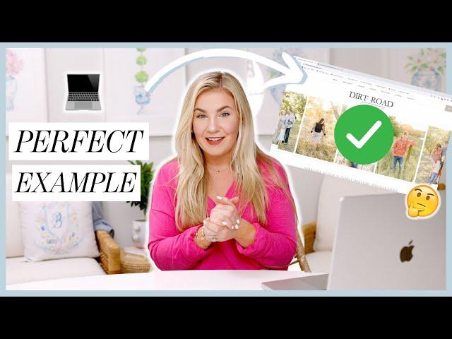
Critiquing YOUR Photography Websites: How to Build a Photography Website in 2023
Комментарии:

This video is very helpful! How can I get you to critique my website? 😂
Ответить
I am a part of the Senior scoop and it is so worth it !!
Ответить
Great feedback super helpful! Thx
Ответить
Do you have any references about doing taxes and creating an LLC?
Ответить
Hope, this video is amazing!!!! I went to your channel to see what website videos you have as I am in the process of updating mine and saw this new one, such good timing! Also considering switching from pixieset to showit to be more elevated and more customizable for my business! This was so so so helpful, also love your website!!! 💕💖🥰
Ответить
Hi! Love this website critique! I am a Norwegian based photographer and i would love to know what your think of my website, even though your will not understand anything of what is written! Haha! I specialize in weddings and familyportraits, but also do offer other services. I have recently upgraded my website, so it would be so useful to get a second opinion!
Ответить
I'd skip the testimonials section entirely and would advise you to drop it. Why? Testimonials ( as uncovered nearly 10 years ago), can be faked and worse - BOUGHT! Also, there are far too many photography websites out there using WHITE as their "go-to" or default background color. First, it's outdated and second, as science has already discovered and published - EYES are attracted to the BRIGHTEST part of any page, and last it smacks of laziness in the arena of customizing and personalizing your site. As in eBay or Google Search, Amazon, etc. As a photographer you never want the viewer to be attracted to, or distracted by - BRIGHT WHITE empty space. You want people to SEE and focus on your images first and foremost.
Ответить
I've tried lots of website hosts/editors over the years and I will back that Showit is my favorite by far.
Ответить


