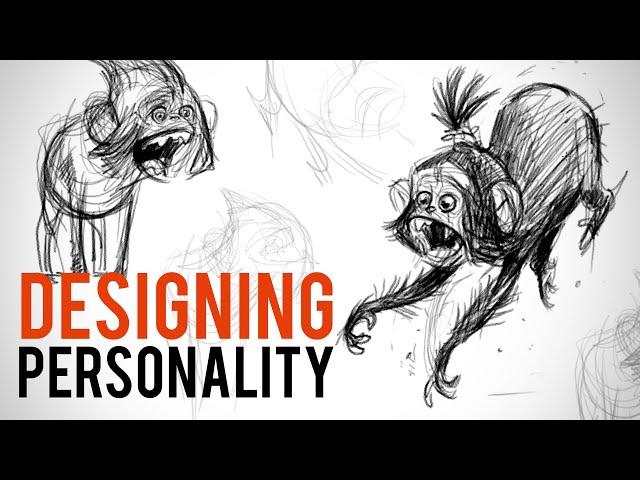
Story Driven Shapes: Character Design Tips with David Colman
Комментарии:

Those 2 monkeys in the thumbnail look like they've escaped from a Francis Bacon painting, The Screaming Pope, especially the one on the left. Terrifying, not cute.
Ответить
I love David's work. Such cool stuff
Ответить
I love how he is having fun while drawing and imagining all the stories. I would like to be like that 😂❤
Ответить
where is my Naughty Boy ????
Ответить
Did anyone else google "froofed"? Lol the Urban dictionary definition makes the whole idea of this chimp having "froofed" hair a tad more risqué 😅. Thanks for the video and tips, as well as expanding my vocabulary 👍🏻
Ответить
Lol. This is really close to my process when designing creatures. It's so. Terryifing failing so many times before finding the look. It's like I forgot how to draw.
Ответить
Your hair might get on your face and you will die 😂😂😂😂😂 checks out
Ответить
but what's the brush, though?
Ответить
Love the vivid way when you play out the jumping ape.😂😂😂
Ответить
Bars!
Ответить
salute to stan and david for such great content - and its for free ! interesting that you dont just lasso the forearms and scale them but find a new pose right away.
Ответить
Your work is really well done and what you are saying rinds true too. Love the t shirt as will.
Ответить
This one video had more info than courses out there
Ответить
This guy’s work is full of energy ❤️
Ответить
is your website down?
Ответить
🐒
Ответить
i'm glad i'm not the only one who has a very messy sketch
Ответить
This is awesome! Thank you very much!
Ответить
The first one is steeeve!
Ответить
great vid, it's really a helpful tip to think of the background and personality of the character when you draw it !
Ответить
Not sure which is more funny. The excellent character design or the keyboard warriors freaking out about taxonomy. Well played sir.
Ответить
Extrorodinary!!!!
S●LID work!!!

1) Chimps are human relatives, not ancestors (2) you drew a monkey, not an ape. You're the "animal guy"???
Ответить
Love the tip about the features!!! Great teacher too. Thanks
Ответить
Sorry to be picky, but apes are not our ancestors, we aren't descended from them.
Ответить
Monke
Ответить
David Colman is one of my favorite artists ever! His art is so expressive and beautiful. I always challenge myself by trying to capture his unique styles of art.
Ответить
So funny!
Ответить
Dude, are you Bronn Blackwater? 😜
Ответить
nice work
Ответить
You guys are offering too many great courses this year! How am I supposed to do all of this?! [pulling hair in desperation]
Ответить
Proko has been killing it in 2021. So so loving your platform so much
Ответить
You are so good at drawing with computer graphics. ~~ ^^
Ответить
I don’t see much personality in these monkeys, besides mouths being open. The personality comes from the expressions, pose, and the shape proportions. King Louie is one he references but Louie is heavily expressive and definitive based on his range in acting. Part of what makes a character design powerful is that the design can stand on its own, you can understand the character (whether it’s an archetype or an impression or a specific nuanced character) without any voice or movement.
The structure of personality goes beyond surface level design and fundamental drawing skills. Personality comes from the part of you that is an actor. If you can act then you can breathe personality into a design by finding the placement of the attitude. Attitude affects how you lean or stand, what muscles on your face do the most work, where the weight is displaced, and how the character’s spine bends (arch, S-curve, straight.) It takes exploration to find personality then you compliment it with shape language that works with the concept you’re going for.
Look at the movie UP. It’s heavily stylistic and graphic, inspired by UPA shape language and “Disney acting.” The proportions on the characters tell you everything without a word spoken. The old man is made up of cubes, which makes him grounded and compliments his “stubborn” personality. The shape limits his animation which actually helps his character. The young boy is made up of soft, round shapes which evokes his naive and vulnerable personality, as well as his innocent optimism. Round shapes resemble baby features which makes us see vulnerability and childlike qualities. Then you have the dog who is clearly the fattest with his short tiny limbs and big body and nose. The dog is drastically more cartoony and is made up of more innocent round shapes making him stand out amongst his angular peers (the other dogs all being sharp or blocky shapes.)
Now that is just ONE way of designing characters. UP in particular is very shape driven. Other movies like Jungle Book are proportion driven but loosely adheres to real anatomy. It depends on the story you’re trying to tell. Goofy comedy is better suited with simple shapes, while a more grounded story is better suited with more complex forms that give the world more grounded rules. In Jungle Book, if Baloo fell 10 stories then he’d die based on what we accept from his design. Meanwhile if a character from UP fell from 10 stories, it could follow more forgiving cartoon logic. If you’re not seeing anatomy (or bone structure) then you can forgive a lot more story wise.

never seen such a mess of sketches.
Ответить
I really like this type o videos where you can see how long it takes for the drawings to be perfect. We look at their drawings and we think our favorite artists don't commit mistakes. I wish I could see the same type of videos with some Mangakas and Comic book artists.
Ответить
TMI dude, I can't keep up with all this content!
Ответить
"I've worked on several bigger projects, and a lot of smaller ones *as we all have*."
[Cries in non-professional entertainment artist]
I think most of Proko's audience, like me, can't relate to that statment. lol 😂....😭

Love. Great demo! 🥰😍
Ответить
Great lesson
Ответить
This level of content production is insane.
Ответить
I love Davids attitude to character design, thank you! Very fun and creative.
Ответить
Is he h Naruto fan "you know" 😄
Great video it's really helpful 😊

This was amazing the explanations, the energy, the advice .... made me not only inspired but honestly happy 😊. Muchas Gracias 🙏 Thank you so much already a member & will join this course 😌
Ответить
Some of us just want to know the brush because we think it looks good and want to incorporate it into our own work, it's not because we think it's the only brush for the job.
Ответить
Thanks for the tips! Its so inspiring 💕
Ответить




![Pokémon RBY | Battle! (Trainer Battle) [GB] Transcription Pokémon RBY | Battle! (Trainer Battle) [GB] Transcription](https://hdtube.cc/img/upload/VW9wNnBMaE1EcXk.jpg)
