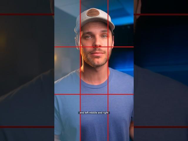
Master the Rule of Thirds for Better Photos #photographytips #shorts
Комментарии:

bharni bantu parihar sote video
Ответить
rule of thirds is great when used appropriately but that headshot example kind of shows why it doesn't need to be used all the time lol
Ответить
bad sample. but yes, interesting as to how did you ever pick that as your example
Ответить
Ngl, the example was terrible
Ответить
vertical is my favorite composition
Ответить
and give it a shot! haaha
Ответить
This has to be rage bait yea?
Ответить
Don’t forget about air for your subject. The headshot so close to the edges, that it feels ugly. Although, it looks quite uncommon and interesting. I’d better crop the head a lot, to make closer😂👍
Ответить
this works for horizontal but not vertical, its totally different for vertical video (or photo), for vertical video, everything should be located as middle as possible, as there are so many different social media with whatever UI they want it to be, so middle it goes
Ответить
Example was terrible
Ответить
very vague explanation, almost sounds like you're not too sure of it yourself
Ответить
Its about composition, focal points directly in the middle of compositions do not garner as much interest from viewers. Great art came first and then came the language and explanations for why the masses seem to like some works over others. The Da Vinci drawing with all the arms and legs was a lesson in interesting compositions.
Ответить
Hahah love the pun at the end.
Ответить
For landscape shots yes, but for vertical shots no - center is the best.
Ответить
Don't use this rule when taking a portrait. 😂😭 It's so awkward to have space's like that.
Ответить
Cool concept for sure. Will try out. I liked this video bc of how high quality it is and the idea.
Ответить
YOU LOOKS LIKE RICK GRIMES (THE WALKING DEAD SERIES STAR)
Ответить
Thank you for saying the "Rule of Thirds" is a suggestion and not an actual rule per se.
The photographer's EYE should be the main rule. However, that "eye for composition" is a process gained from formal training, experience, and natural talent.
I was a professional photographer from 1970 to 1975, and I respectfully disagree using the Rule of Thirds for the portait ("classic headshot") in your video, especially when the subject is that close in the FoV and is looking directly into the lens. At that point, the subject's eyes become the subject of the picture.
I hope my opinion was helpful.

One of the most iconic pictures ever “Afghan Girl” by Steve McCurry is a portrait with the subject smack in the middle of the picture. It’s center dominant eye composition.
Ответить
Thanks man
Ответить
does this rule also apply to videos ?
Ответить
the headshot doesn"t work because you generally leave space in front of subject, not on his back
Ответить
Lirt
Ответить
What in the AI is going on with your face in thia clip? You look like a cartoon.
Ответить
problem with following photography rules, when it comes to using the photos in apps like canva, you don't have much wiggle room to create something outstanding.
With apps like canva now, you wanna break all the rules, then you'll have far more material to use and be able to create far more exciting creations blowing people away.

I did not learn anything in this short tbh.
Ответить
Cool video, thanks! I appreciate that your last shot and first shot are one shot. “Try turning on the grid the next time you’re feeling artistic and give it a… shot…Your images can look way better if you follow this easy rule.”
Ответить
indeed
Ответить
You look like a talking A.I😮
Ответить
You took the worse example for this😂
Ответить
But your headshot video is in the centre
Ответить
are we teaching photography 101 now? :o
Ответить
Why is it so hard for me to take a nice picture eventhough I tried so much more using their tips whenever these guys do it looks like they just took it so simply 😢
Ответить
The headshot wasn’t the best example of it. In my opinion I believe that with close shots you should always position your subject right in the middle idk I’m not an expert
Ответить
I find putting it on the grid looks weird.
Ответить
Wrong demo😂
Ответить
The headshot example wasn't a wrong one it wasn't told well
Free space should be Infront of your subject so if she went to the left side it wouldve been perfect

Wow the first exemple of the portrait was horrible
Ответить
Nailed colour grading
Ответить
Good job teaching. Remember tho: Rules(of thirds) were made to be BROKEN!!
Ответить
that gridlines with one hand drawing ... badass dread lines
Ответить
Thank you 🎉
Ответить
Nice
Ответить
you sure about what you talk about and what you showed?
Ответить
quedo 10 veces peor las lineas so para que la fotografia quede equilibrada
Ответить
It might also help looking as damn good as you
Ответить
Yeah woow
Ответить
Really bad example with the headshot
Ответить
But if its a photo for your license and or documents that requires your face rule of thirds are kinda odd
Ответить
I often photograph my mother. Imagine doing this to her. She'll freak out! I'm talking Randy Level freakout!!!😂
Ответить

![[빈딕투스: 디파잉 페이트] 알파 테스트 트레일러 풀버전(ver.2) [빈딕투스: 디파잉 페이트] 알파 테스트 트레일러 풀버전(ver.2)](https://hdtube.cc/img/upload/c3M5N0thUldqcFY.jpg)


