9 advanced tips of layout & composition in Web Design
Комментарии:

Any follow up questions? Shoot!
Ответить
Thank you :).
Ответить
Dude your a legend thanks! you got the adhd in me thinking creative again
Ответить
The age of desktops and laptops are gone. I always start with a mobile version of the site and work my way up to big screens. Small to big is always better than big to small. Works on all aspects of life.
Ответить
why do I feel like you're jut reading a script written by an AI the longer I watch the video ?
Ответить
Great video Bont. What web design tools do you use in designing your websites?
Ответить
thanks ! loved all of the tips, i'm just dipping my toes into web design and here after my first ever design in figma.
also just wanted to note, the video looks amazing and very professional, the last 1 percent that's missing is some kind of background music
other than that it was very useful thanks a lot !

Amazing!
Ответить
i love your websites!! is it possible to see more of your website projects?
Ответить
Yall hating in the comments. Not mobile, complicated, difficult. Jeez, cry me a river. He's clearly got a style and is if it's not for you that doesn't mean the sites are bad.
Ответить
This is the Worst advice ever. Your clients needs is appealing to their clients who are normal people, they want something simple and minimalistic, only bald tech bros with their 5k$ MacBook want to see that kind of design
Ответить
awesomeness here
Ответить
Didn't heard anywhere what you're saying! I'm starting my web designer journey and I'm getting excited by what you're saying! First video that I've watch from you and I want to know more about how you think and work.
Will definitely join your program as soon as possible! I've subscribed and I'll do your free course soon! Thanks for the value!

Amazing content mate.
Ответить
Hi, how are you Bont? About the first tip (or LAW). What would be the content that should guide me? The content of the product is what it teaches or what it is. Or the COPY that I will use in my layouts.
Ответить
Still thinking what to place, as a content, to that small texts. If I have text from copywriter for heading and text (claim) what to put there?
Ответить
Your content is always inspiring! one question come to my mind, how do you translate it to code or hand it off to developer? is there extra step? especially for the golden canon grid. Anyway, thank you so much🙌🙌
Ответить
how to responsive this design for all device
Ответить
Loved the video!!! Any recommendations on where to learn the technicality and how to build designs like shown.
Ответить
Love it! This has got to be the most comprehensive video on layout!
Ответить
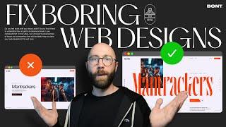
for mantrackers i am not able read context/ text and the image is dominating mantrackers. if you feel that my feedback is correct or if not please give me an explanation why did you used typography in such way there
Ответить
Nice explanation
Ответить
Another gem. 🙏🏽
Ответить
What platform are you using for your designs
Ответить
This is just me, I am ok with boring site as long as they 1) provide good user experience so the visitor can easily understand/find what they are looking for and 2. ) Convert/engage. We do not design for ourselves but for the users of the sites.
Ответить
Tons of valuable information, thank you so much. It helped me a lot.
Ответить
hi gret video as a new web designer this video helped me a lot! i was wondering about the svg bridge and the car did you din that readyor did you make it your self? i am looking for websites that offer those images and svg files and icons like this one even paid of course, so yif you could share some links where i could find those it would be a huge help :)
thanks in advance

These are excellent insights not just for web design but design and layout in general. I’m not a web designer but this resonates with me for all areas of graphic design - branding, print, digital and video & motion graphics. 👍
Ответить
How come you designed your page on a 1920px 1080px dimension instead of the standard frame that figma uses for desktop? I've been struggling with correct website dimensions for a while. I get the issue of making the design responsive for scaling, but shouldn't you design on the figma frame?
Ответить
Is this design and the development or only design?
Ответить
where could I find boring website or old websites for redesign ?
Ответить
bro no way I xame across this!!! this was amazing
Ответить
Pkaymetal website looks a bit confusing and messy.
Ответить
Great advice! Thank you for your help.
Ответить
Thanks, dude. I'm very glad that I found your channel
Ответить
Thank you
Ответить
Not boxing font
Ответить
The examples you use are incredibly beautiful but 1. Wastes a lot of space, so bad UX. If the user has to scroll more than 3 or 4 folds youve lost them. 2. Some are very hard to read or have bad contradts. Bad forr accessibility. 3. Complex structure. there's no reading order or the reading order is hard to find. The UI is amazing. The UX could use some work.
Ответить
MOBILE FIRST. Why we keep showing off desktop horizontal layouts that do not translate to phones is pointless.
Ответить
I love your design, love your approuche, feeling all you talked about, keep going!
Ответить
Sir your Thumbnail font name please 🙏
Ответить
this is the way
Ответить
Thank you for so useful content, definitely will go to check out the course 😊
Ответить
Hi, very informative video. Could you explain that Grid from the Iterations or grids in general in another video?
Ответить
Can I create this advanced Designs and recreate then in wordpress/Elementor without coding ? (in case I want do my own, not the client projects)
Ответить


