Комментарии:

this gave me a little serotonin boost, i'm currently sick and rest in bed all day .-.
Ответить
Random question - do you have a link for your chair?
Ответить
I'm here pretty early for once! So excited.
Ответить
One of my fave paintings by you. Its absolutely breathtaking
Ответить
the painting is yumm!
Ответить
Are these reg or water soluble oils? Also, i love to layer, so im wondering how long this took to dry and how hard it was to layer? That's my biggest qualm with oil paints. They just take so long to dry, and I'm so impatient😂
Ответить
The painting looks amazing!
Ответить
Damn shes fine
Ответить
I wonder if adding just a touch of black to the red before mixing in the white could give you a less pink tint? Hmmmmm. I use a limited palette of just red, blue, yellow and white. I mix my own black if I need it. Like you said it creates color unity right away, as everything on the painting is made from different combinations of 2-3 colors. It also helps me organize my thinking and I start to not only see things in colors but in color temperature and value.
Ответить
god i love a good portrait
Ответить
This is easily one of my favorite paintings you've ever done!! It looks so lively and definitely reflects you as an artist (at least in my opinion)! Incredible :)
Ответить
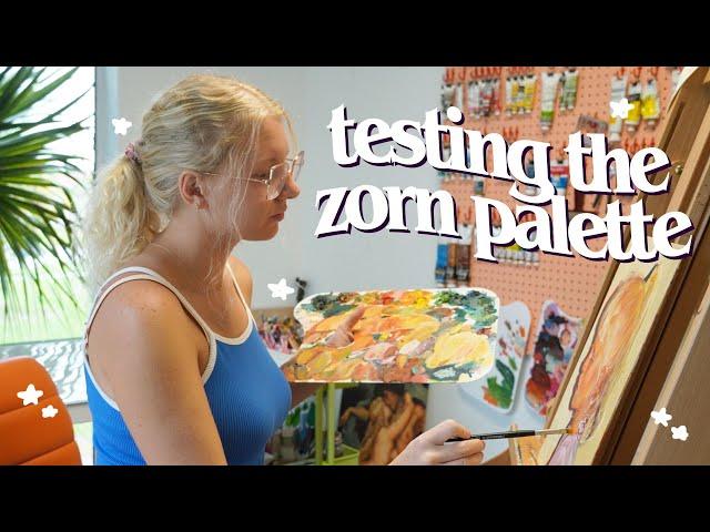
Just gonna drop here that I think why the warmth of the modified Zorn palette works here is that this warmth helps frame that this was an actual moment in the past (ie:a snapshot) as the natural tones mirror how photos from our past tend to lean.
Ответить
its the lilzornerd pallette. U made it ur own and it's looking beautiful
Ответить
Sorry if you said this in the video but what medium did you use with your oils? This turned out so good btw!!
Ответить
I recently did a painting of my gramma with a modified Zorn palette and LOVED IT. The painting itself, the process, everything. And I learned about the palette from you! Thank you so much for talking about and creating with this palette, and I love this painting so much!
The modification I made was instead of doing black I made a dark mix of ultramarine blue and burnt umber and I love it because I can make the mix a little warmer or cooler depending on what I need to pull off in the painting.

Wow!! Awesome work 😊
Ответить
I love you,you are so sweet! ❤
Ответить
This came out so pretty!! It's really exciting to see you exploring and taking steps toward your goal of creating a collection. When you talked about an orange you wanted to use, it reminded me of pyrrole orange. Unfortunately, it seems like its formula is inconsistent with different brands, but it is one of the few saturated oranges I tend to like. Now I want to try to use it with a portrait!
Ответить
Thanks for the demo of this; we have so many materials choices available that it's a good exercise to minimize. I could see myself doing some Zorn or Zorn + 1 pieces, as I like the results I've seen in demos of picking one shade of yellow, blue, and red to use for unity in a piece. Plus my preferred subject matter is animals/natural forms. However, I am a tetrachromat with blue as a favorite color, so there will always be blue-centric work as well.
Ответить
Looks gorgeous!
Ответить
the painting turned out wonderful! def one to hang on the wall and be proud of🥰😀
i do like the thought of using a limited palette, but i like colour too much to just use a few in one painting lol

leaving a comment because this deserves more. your art is amazing!
Ответить
I am HERE for more old skool paintings 🥰🥰
Ответить
I see what the problem is, the zorn pallette is made for natural muted tones while you prefer bright tones, hence adding the cad yellow. I say dont force a pallette to work for you, or force yourself to work with a pallette that goes against your preferences. The zorn pallette is not an end all be all to limited pallettes, you can build your own pal. that caters to your own tastes, all it needs a stand in for yellow (can be any yellow or an ochre), a stand in for red (can be a red, a vermillion, even a sienna) and a stand in for blue (can be a blue, an aquamarine, even a black) then you can add to it white, and one or two other colors that you find yourself using a lot and enjoying ( can be literally anything but id say a specific secondary color would work best, or a nice brown). We did something like this in artschool, where we had a white, a black stand in for blue, yellow ochre as yellow and i think burnt sienna as red? And burnt sienna is by all means NOT a red, but in combination with the other colors it was the reddest tone and it served that purpose. The black served as blue and was very effective, since the other colors were very warm, mixing black and white gave a grey that i kid you not looked blue on the painting, tbh it was mind boggling.
Ответить
For making really vibrant and bright oranges I have found magenta to be an absolute game changer because I too like absolutely love the color red. I want intense red and I feel like how most paints are made. They lean pink so fast like you can’t dilute it to keep it red and a lighter red like it’s pink immediately, and so magenta, adding it to my pallet has really really changed it where I can keep my red red and lighten them without it turning pink and making orange so more itself
Ответить
❤❤❤
Ответить
So good! I experience that color love, overload and yearning for a limited cohesive palette. It would help my focus and less buzzing with decisions. I’m on board, maybe not the Zorn way but a feeling my way way 😂
Ответить
I’d love to see the zorn with a cool color added. 😊
Ответить
❤ Wonderful work ❤ Love it soooo much!!!
Thanks for sharing your painting process.
Please check out my art channel as well. Hope you like it! ❤
Greetings from Portugal!

Hi there, love your Self portrait.
What about trying magenta Zorn pallet?

About your range of colors and having a hard time with orange, I highly recommend to read the articles by James Gurney about the color wheel which end with the “Yurmby Wheel”, and Bruce MacEvoy’s articles that end with his basic palette and complete palettes. Essentially they recommend using Cyan, Yellow, Magenta, Red, Green, Blue as the primaries. The pigments being: Phthalo Blue GS, Cadmium Yellow, Quinacridone Magenta, Pyrrole Red, Phthalo Green, Ultramarine Blue. The point of those colors is for mixing, you rarely use them pure as they are in the tubes. Adding some earth tones would complete that palette.
Ответить
One thing for mixing bright secondaries, rather than just using them out of the tube, is considering which way the colours lean. You'll get the brightest orange from an orange leaning yellow (warm) with an orange leaning red (also warm), the brightest purple from a pink/blue leaning red (cool) with a red leaning blue (warm), and the brightest green from a greenish yellow (cool) with a greenish blue (cool). Once you learn which way certain pigments tend to lean, it can make buying colours to round out a palette much easier. E.g. in this case, where you wanted bright oranges, a cad red light might be better as they tend to lean more orange, or maybe vermillion. Apparently cad red medium is often a warmer red but some brands make it cooler than others! Then you want a warm yellow, so the cad yellow is good! A lemon yellow would not work here as it's too green leaning and would mix a muddier red/brown (think of all of these primaries as having a little of a second colour in; when you mix colours opposite on the colour wheel they neutralise each other, going brown or grey, so mixing primaries that don't both lean towards the same colour is similar to adding a little of the complement of one of the colours into the mix, if that makes sense?)
Apologies if you already knew all this! If so, I hope this info can be of use to someone else!
I absolutely adore how this painting turned out. I think the overall warmth really plays well with the subject matter; it gives an almost nostalgic feel? I really like it! There's something super satisfying about the combination of the warms and cools around the eye. I've tried the zorn palette (modified, as I used vermillion for the red, and did it in acrylic) and it's wonderful for portrait painting in a specific style!
